Brand design
The design of a brand requires assiduous research work: the identity and values of a brand or product must be communicated, synthesizing them with a symbol or logo.
This will be unique and recognizable, memorable and adaptable to various communication media: from digital, to print, to corporate gadgets.
In this project I created my personal brand, which I use for my freelance business, on all social channels, on business cards and in all necessary situations.
There are all possible variants, from the pictogram, to the logotype and payoff, in color, single-color, 3d versions, on various supports and in various layouts.
Terracquea – Visual identity for a sustainable brand
Objective of the work
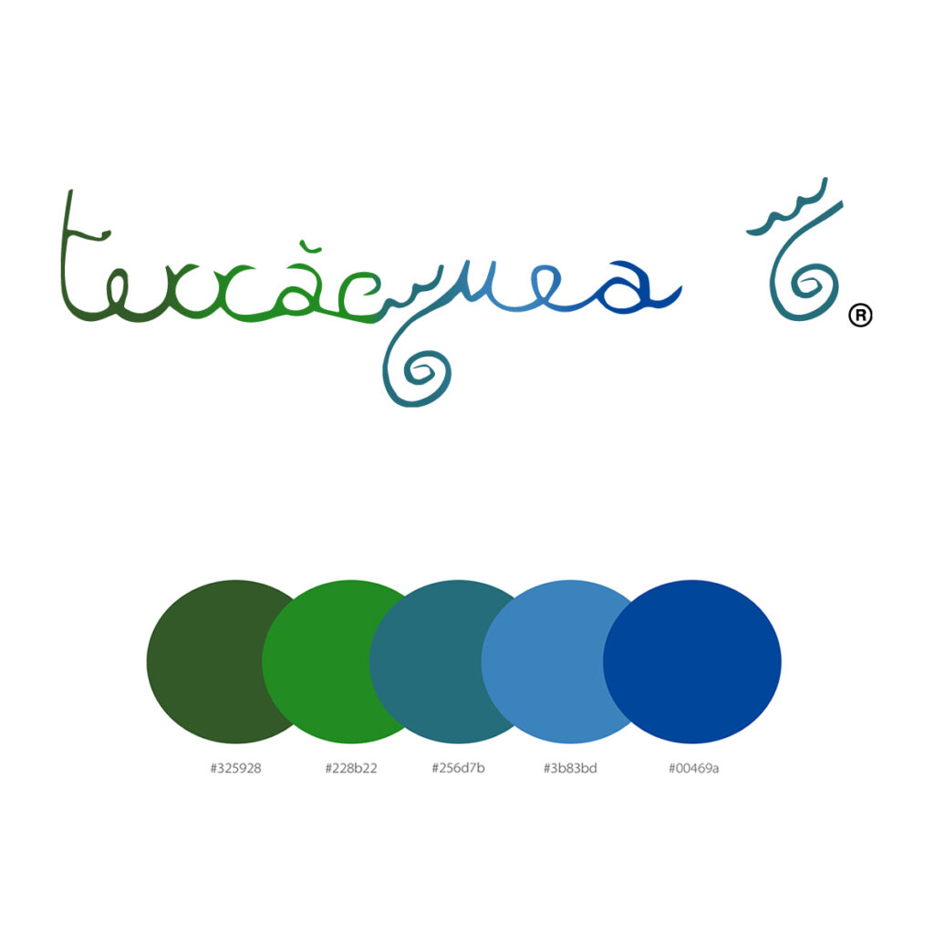
To create a distinctive visual identity for Terracquea, a brand (registered trademark) founded by Giulia Caccopardo, garden designer and mycologist, focused on sustainability. The goal was to graphically translate the brand’s values, emphasizing the connection between land and water.
Creative process
The logo was initially hand-drawn by the founder and then transformed into a vector version to ensure scalability and adaptability to different media. The choice of color palette – shades of green and blue – recalls the fundamental natural elements: vegetation and water. The fluid and organic typography and the blending color shades strengthen the bond with nature, creating a harmonious aesthetic.
Added value for the customer
The new vector logo ensures greater versatility and recognizability, facilitating application on various communication materials. The use of evocative colors reinforces the sustainable identity of the brand, improving its visual coherence and appeal to the public sensitive to environmental issues.
Software used: Adobe Illustrator
Hamana – Visual identity for a holistic brand
Objective of the work
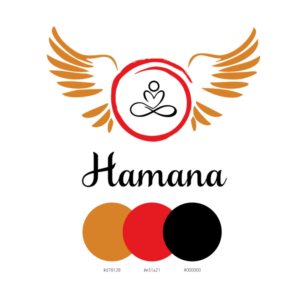
To create a visual identity for Hamana, the brand of Simona Barzon, a holistic operator. The logo had to reflect its essence and values related to energy, balance and spirituality, fundamental elements in the holistic world.
Creative process
The concept starts from a visual intuition of the client, which was transformed into a vector version to ensure clarity and versatility. The logo combines minimalist iconography with stylised wings and a red circle, a symbol of harmony and inner power. The colour palette – red, gold and black – was chosen to express passion, energy, balance and strength.
Added value for the client
Hamana’s visual identity clearly and powerfully conveys the brand’s values, strengthening its presence in the holistic sector. The vector design allows for optimal use on various communication media, ensuring consistency and recognisability.
Software used: Adobe Illustrator
Anna Journal – Visual identity for a wellness brand
Objective of the work
To create a logo that expresses the philosophy of Annalisa Picca, a physical activity instructor, emphasizing her 360° approach to wellness. The design had to integrate concepts of energy, harmony and transformation, maintaining a strong connection with the symbolic elements of her practice.
Creative process
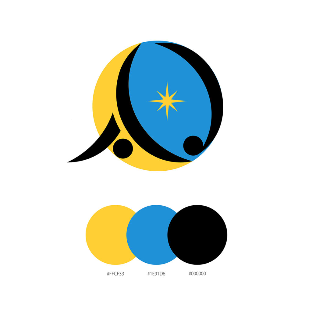
The logo was developed starting from the initials “A” and “J”, transformed into stylized figures in movement, to evoke dynamism and personal growth. The use of fluid shapes and the presence of a star recall inner guidance and the connection with the lunar cycle. The color palette – yellow, blue and black – conveys reliability, security and tranquility, combined with optimism and dynamism.
Added value for the customer
The logo offers a distinctive visual identity consistent with the brand’s values, strengthening its presence in the holistic wellness sector. The vector design guarantees versatility, adapting perfectly to different formats and communication channels.
Software used: Adobe Illustrator
New Pro Loco Acaya – Visual identity for the promotion of the territory
Objective of the work
Create a representative logo for the “LOGO NUOVA PRO LOCO ACAYA” ideas competition, summarizing the values of the association and its commitment to the protection and enhancement of the environmental, tourist and cultural resources of the village of Acaya.
Creative process
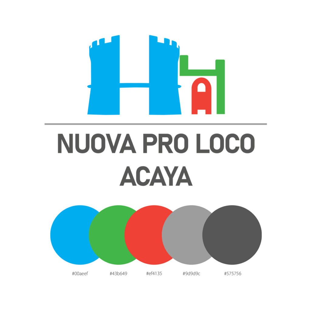
IThe logo incorporates the outline of the historic walls, a symbol of the territory’s identity, integrated with modern graphic elements to convey a sense of openness, solidarity and cultural exchange. The color palette was selected with precision:
Blue: safety and reliability
Green: environmental protection
Red: strength, authority and dynamism
Neutral grays: balance and stability
Added value for the customer
The logo offers a strong visual identity consistent with the mission of the Pro Loco, facilitating the cultural and tourist promotion of Acaya and strengthening the sense of belonging of the local community.
Software used: Adobe Illustrator
Rosedi Wellbe– Visual identity for a holistic brand
Objective of the work
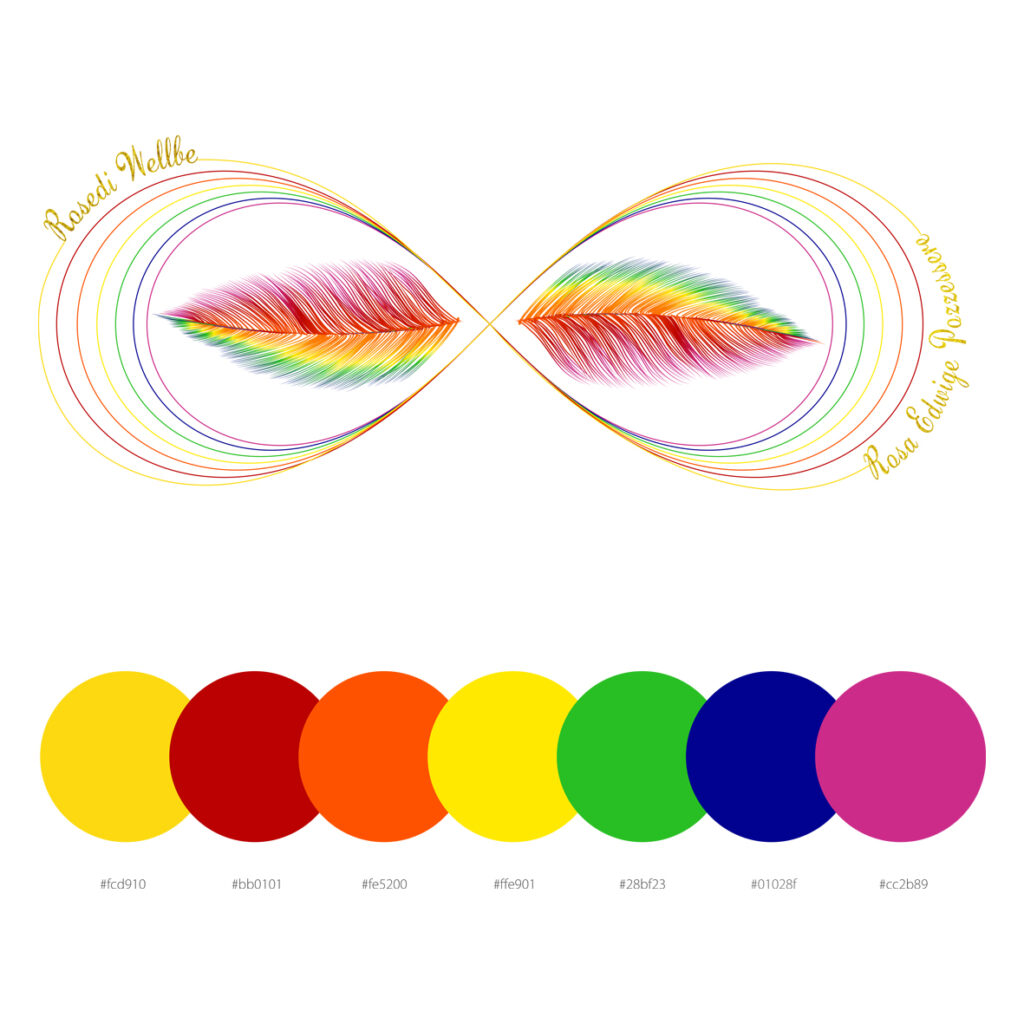
To create a visual identity that represents the essence, energy, balance and harmony promoted by Reiki, in line with the vision of Rosa Edvige Pozzessere, Reiki master.
Creative process
Starting from the logo hand-drawn by the founder, I created a vector version to ensure versatility and scalability. The color palette embraces the colors of the seven chakras, symbolizing the connection between body, mind and spirit. The symbols integrated into the design evoke the lightness and freedom achievable through Reiki practices.
Added value for the client
The visual identity developed effectively communicates the core values of Rosedi Wellbe, creating an immediate connection with the public interested in holistic well-being. The vector design ensures consistency across different communication media, while the use of chakra colors strengthens the association with the energetic practices of Reiki.
Software used: Adobe Illustrator
