
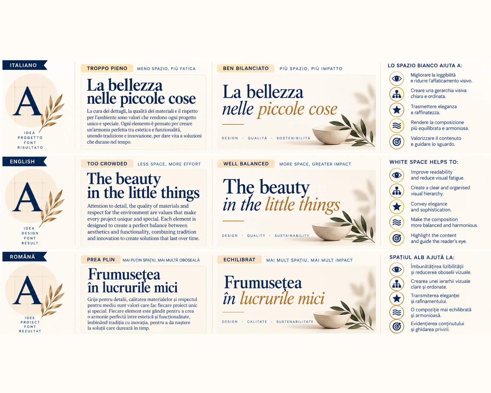
After exploring the emotional power of fonts, it is time to focus on an often invisible yet essential element of visual communication: white space.
In graphic design, letters, colours and images are not the only elements that communicate. The spaces separating them also help create balance, hierarchy and rhythm.
Text that is too tightly packed can be tiring to read, while a well-organised composition allows the eye to move naturally.
Because in typography, just as in music, pauses also carry meaning.
What Is White Space in Typography?
White space, also known as negative space, refers to the empty areas surrounding and separating the elements of a composition.
It does not necessarily have to be white: it can be any colour or a uniform background.
In typography, it appears through:
- Leading: the vertical distance between lines of text.
- Tracking: the overall adjustment of spacing between characters.
- Kerning: the adjustment of spacing between specific pairs of letters.
- Paragraph spacing: the distance separating different blocks of content.
- Margins and empty areas: the spaces defining the text area and its relationship with other graphic elements.
These seemingly minor details significantly influence readability and the perception of a design.
Space is not an absence: it is a design decision.
The Role of White Space in Visual Communication
Well-managed space creates order without adding unnecessary elements.
Its main functions include:
Clarity and readability: appropriate spacing between letters, words and paragraphs makes reading easier and reduces visual fatigue.
Visual hierarchy: the distance between elements helps distinguish headings, subheadings and content, guiding the eye towards the most important information.
Elegance and sophistication: spacious compositions can communicate exclusivity, balance and attention to detail.
Rhythm and harmony: alternating filled and empty areas creates a smooth and pleasant visual journey.
Content enhancement: leaving space around an important element increases its visibility without necessarily changing its size or colour.
Active and Passive White Space
In design, white space is often divided into two categories.
Active White Space
This is space intentionally used to create structure, hierarchy and focus.
A headline placed in the centre of a page, surrounded by a large empty area, immediately gains greater importance.
Space thus becomes an integral part of the composition.
Passive White Space
This is the space required to ensure readability and natural separation between elements.
Examples include spacing between words, lines and paragraphs.
Even when it is not consciously noticed, it contributes to reading comfort.
Both types are essential for creating a balanced layout.
White Space Across Different Industries
The use of white space varies depending on the context and communication objectives.
Branding and visual identity: clean, well-spaced compositions can strengthen brand recognition while communicating order, confidence and professionalism.
Fashion and luxury: generous margins, isolated headlines and airy layouts are often used to suggest exclusivity, elegance and sophistication.
Publishing and magazines: a balanced relationship between text, images and empty areas improves readability and makes content more enjoyable to explore.
Web design and UI/UX: white space helps organise information, separate sections and make navigation more intuitive.
Packaging: packaging with a limited number of well-positioned elements can communicate quality, care and attention to the product.
Advertising and communication: leaving space around the main message can increase its impact and make it more memorable.
When Empty Space Takes Centre Stage: The Example of Apple
One of the most recognisable examples of white space in contemporary visual communication is Apple.
In its advertising campaigns and product presentations, the brand frequently uses minimalist compositions with few elements and generous empty areas.
The product becomes the focal point, while typography, generally understated and carefully organised, supports the message without overpowering it.
This visual approach helps communicate simplicity, precision and attention to detail.
White space is therefore not merely decorative, but a strategic component of visual identity.
The Risks of Using White Space
Even white space, when poorly managed, can compromise communication effectiveness.
Common mistakes include:
- Excessive spacing: overly large gaps can interrupt the reading flow and make relationships between elements difficult to understand.
- Insufficient spacing: overly dense text can feel tiring and uninviting.
- Unclear hierarchy: inconsistent spacing can create confusion rather than order.
- Excessive minimalism: removing too many elements can compromise the completeness of information.
- Lack of adaptability: spacing that works well on a poster may not be effective on a smartphone.
The goal is not to use as much space as possible, but to find the right distance between elements.
Conclusion
White space is one of the most subtle yet powerful tools in graphic design.
It adds no words, images or colours, yet it helps define the perception of the entire composition.
Through margins, distances and proportions, it allows typography to breathe, content to stand out and messages to reach readers more clearly.
Because designing also means knowing what to leave out.
And sometimes, in design, it is precisely the space between words that gives strength to what we want to communicate.
In the next article, we will explore the relationship between typography and colour: because the colour of letters influences not only aesthetics, but also readability, emotions and the communicative power of a design.