After discovering how to choose the right font for every project, it is time to explore a more subtle, yet equally important, aspect of visual communication: the emotional power of typography.
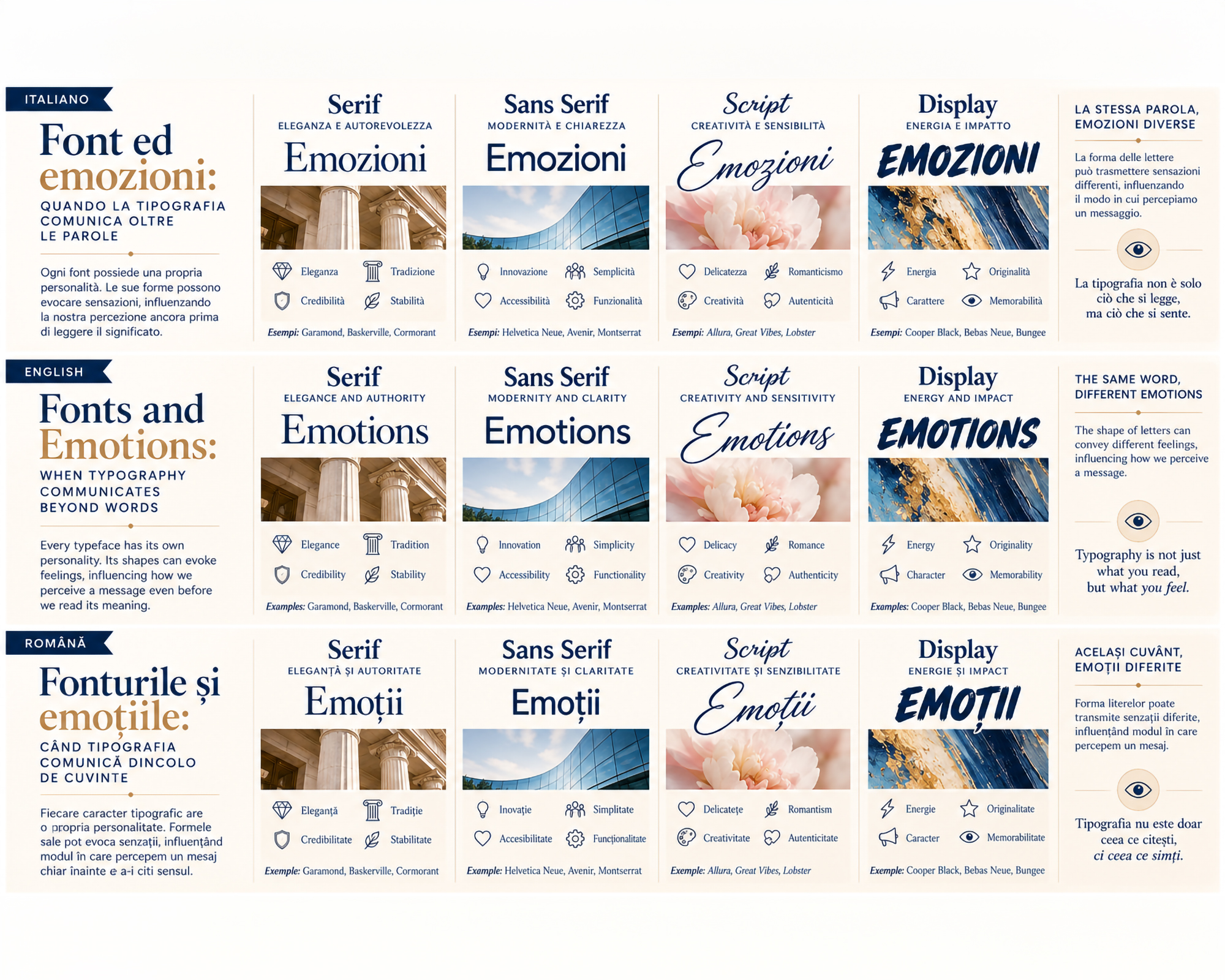
Every typeface has its own personality. Its shapes, proportions, curves and stroke weights can evoke different feelings, influencing how we perceive a message even before reading it.
Typography does more than give shape to words: it helps define their tone, atmosphere and emotional meaning.
The Emotional Language of Fonts
Just as colours can evoke emotions and associations, the visual characteristics of fonts also influence perception.
A typeface with thin, elegant strokes may suggest sophistication, while one with bold, compact forms can communicate strength and determination.
Rounded letters tend to convey softness and approachability, while more rigid geometric structures may evoke precision, order and rationality.
However, these associations are not universal: they also depend on cultural context, personal experiences and the other elements of the composition.
The shape of letters thus becomes an integral part of the message.
How Different Typographic Styles Influence Emotions
1. Serif: Elegance, Trust and Authority
Serif typefaces, with their finishing strokes and proportions often associated with traditional publishing, can evoke:
- elegance and sophistication;
- authority and credibility;
- tradition and continuity;
- stability and trust.
Examples: Garamond, Baskerville, Cormorant Garamond.
They are particularly suitable for editorial projects, luxury brands, institutions and communications seeking to convey prestige and reliability.
2. Sans Serif: Clarity, Modernity and Approachability
The essential forms of Sans Serif typefaces can communicate:
- modernity and innovation;
- simplicity and transparency;
- accessibility and immediacy;
- balance and functionality.
Examples: Helvetica Neue, Avenir, Montserrat.
They are widely used in contemporary branding, digital interfaces and corporate communication, where clarity and recognition are essential.
3. Script: Sensitivity, Creativity and Intimacy
Script fonts, inspired by handwriting and calligraphy, can evoke:
- delicacy and romance;
- spontaneity and authenticity;
- creativity and movement;
- emotional closeness.
Examples: Allura, Great Vibes, Lobster.
They are commonly used in wedding design, artisanal packaging, personal branding and projects seeking to communicate a more human and personal dimension.
4. Display: Energy, Originality and Impact
Display fonts stand out through distinctive shapes, unusual proportions and strong visual personalities.
They can convey:
- energy and dynamism;
- originality and unconventionality;
- boldness and character;
- surprise and memorability.
Examples: Cooper Black, Bebas Neue, Bungee.
They are ideal for posters, advertising campaigns, editorial headlines and visual identities designed to stand out immediately.
Emotional Typography Across Different Industries
The emotional value of a typeface also changes depending on the industry in which it is used.
Branding and visual identity: typography helps shape a brand’s personality. An elegant typeface can reinforce premium positioning, while a more informal one can communicate approachability and spontaneity.
Fashion and luxury: refined Serifs, strong contrasts and spacious compositions can suggest exclusivity, sophistication and elegance.
Technology and innovation: geometric Sans Serifs and minimalist structures can evoke precision, efficiency and modernity.
Food & beverage: soft, rounded or handwritten-inspired fonts can convey conviviality, tradition and authenticity.
Wellness and cosmetics: delicate strokes, harmonious curves and balanced proportions can suggest serenity, gentleness and care.
Publishing and culture: typography can create different atmospheres, from institutional seriousness to artistic experimentation, helping define the character of the content.
When Form and Message Meet
A font can profoundly change the perception of the same word.
Imagine writing the word “FUTURE” using three different typefaces:
- In a light geometric Sans Serif, it may suggest innovation, openness and progress.
- In a classic Serif, it may evoke continuity, stability and long-term vision.
- In a bold, experimental Display font, it may communicate change, energy and a break from convention.
The word remains the same, but its emotional interpretation can change.
It is precisely in this relationship between content and form that typography reveals its communicative potential.
The Risks of Emotional Typography
Emotional typographic communication also requires balance and awareness.
The main risks include:
- Excessive expressiveness: an overly decorative font may draw attention to its form rather than the message.
- Emotional inconsistency: a playful typeface used in institutional communication may undermine credibility.
- Visual stereotypes: rigidly associating certain styles with specific genders, ages or groups can limit the effectiveness and inclusivity of communication.
- Poor readability: the pursuit of originality should never compromise text comprehension.
- Different cultural interpretations: a font perceived as elegant in one context may evoke different associations in another.
The most effective choice always comes from balancing emotion, readability and design consistency.
Conclusion
Typography has a voice that extends beyond the meaning of words.
Through shapes, proportions, rhythm and contrast, every typeface contributes to creating an atmosphere and guiding the perception of a message.
Choosing a font therefore means deciding not only how we want to communicate, but also which emotions we want to evoke.
When form and content find the right balance, typography becomes a powerful tool for creating authentic connections between a brand and its audience.
Because words tell a story, but the way they are written helps us feel it.
In the next article, we will explore the relationship between typography and white space: because in design, it is not only the letters that communicate, but also the spaces surrounding them, creating balance, rhythm and visual harmony.