After exploring how typography contributes to a brand’s visual identity, we come to one of the most important questions for every designer: how do you choose the right font for a project?
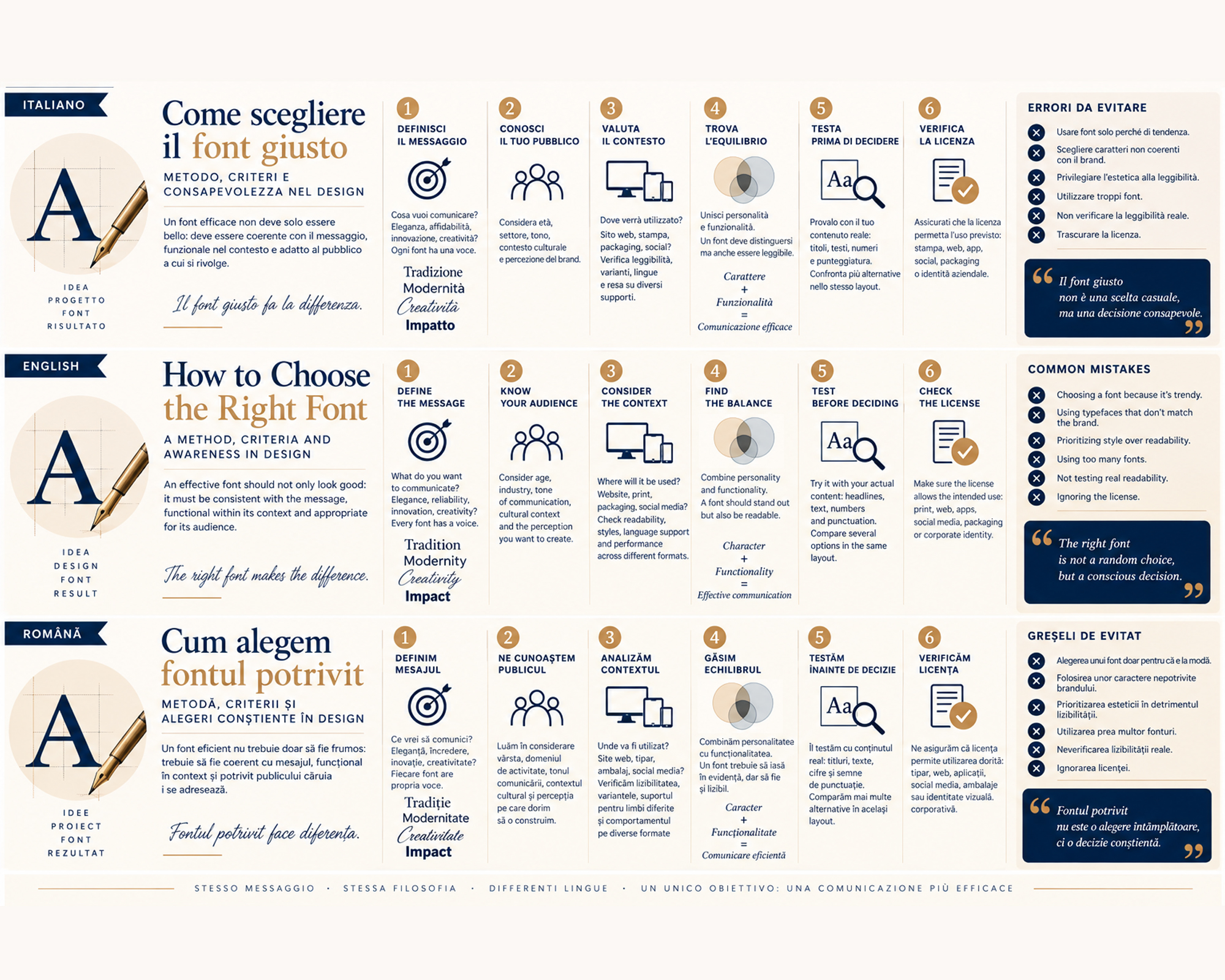
With thousands of typefaces available, it can be tempting to rely simply on personal taste. But an effective font should not only look good: it must be consistent with the message, functional within its context and appropriate for its audience.
Choosing a typeface therefore becomes a true design process.
Start with the message, not the font
Before opening a font library, it is useful to ask:
What should this project communicate?
Elegance? Reliability? Innovation? Creativity? Approachability? Authority?
Every typeface has its own voice.
A classic Serif can communicate tradition and authority, while a geometric Sans Serif can suggest modernity and precision. A Script typeface may evoke craftsmanship or intimacy, while a distinctive Display font can become a central element of the communication.
The right font is therefore not necessarily the one we like the most, but the one that best interprets the message.
Know your audience
Typography also communicates through cultural references, habits and expectations.
A typeface that works perfectly for a luxury brand may feel distant in communication aimed at children. Likewise, a playful font may lack credibility for a law firm or financial institution.
Before choosing, it is important to consider:
- the age and characteristics of the audience;
- the relevant industry;
- the tone of communication;
- the cultural context;
- the perception the brand wants to create.
Designing also means learning to see the message through the eyes of the people who will receive it.
Consider the context of use
A font never exists in isolation.
It may appear on a website, packaging, poster, brochure, catalogue, logo or digital interface.
What works beautifully in a large headline may become difficult to read in a long paragraph or on a small screen.
Before making the final choice, it is therefore important to check:
- readability at different sizes;
- performance in print and digital environments;
- availability of weights and styles;
- support for the characters required by different languages;
- performance across different devices and formats.
A good font has to work, not simply look good.
Personality and functionality must coexist
One of the most delicate balances in typography is the relationship between character and readability.
A highly distinctive font can make a project immediately recognizable, but if its personality interferes with reading, it loses its effectiveness.
Conversely, an extremely neutral typeface may offer excellent readability without providing enough identity.
The solution lies in balance:
personality to stand out, functionality to communicate.
Test before deciding
A font should never be selected solely on the basis of its name displayed in a type catalogue.
It is important to test it using the project’s actual content.
Headlines, paragraphs, numbers, uppercase and lowercase letters, and punctuation can reveal characteristics that a simple preview cannot show.
It is also useful to compare several alternatives within the same layout.
Sometimes a typeface that looked perfect on its own loses its strength once placed within the project, while a less obvious choice may find its ideal balance precisely in context.
Licensing is also part of the project
A less visible but essential consideration is font licensing.
Before using a font professionally, it is important to verify that its licence covers the intended use: print, web, applications, social media, packaging or corporate identity.
This too is part of designing consciously.
Mistakes to avoid
Some of the most common mistakes include:
- choosing a font simply because it is fashionable;
- relying exclusively on personal taste;
- ignoring the target audience;
- failing to test readability at actual sizes;
- using too many typefaces within one project;
- prioritizing aesthetics and originality over functionality;
- overlooking licensing and required character support.
The question should therefore not be “Do I like this font?”, but:
“Is this the right font for this project?”
Conclusion
Choosing a font means making a visual, functional and strategic decision.
The right typeface emerges from the relationship between message, audience, context, personality and readability.
When these elements find their balance, typography stops being simply an aesthetic choice and becomes an integral part of communication.
Because in design, there is no universally perfect font.
There is the right font for the story we want to tell.
In the next article, we will explore fonts and emotional perception: because the shapes of letters do more than communicate words—they can evoke feelings, atmospheres and expectations before the message is even read.