June marks the beginning of summer: longer days, brighter sunshine, and a surge of vibrant energy. It’s the perfect time to talk about a color that encapsulates all this dynamism—orange. Bright, energetic, and inviting, orange brings a radiant presence to visual communication.
The meaning of orange
Orange is a blend of red (energy) and yellow (positivity), and like its “parent” colors, it conveys strong, engaging emotions. It is associated with:
- Creativity and enthusiasm: it invites innovation and a playful approach.
- Warmth and vitality: it feels welcoming and stimulating, like a summer afternoon.
- Optimism and confidence: it inspires, uplifts, and brings a positive mood.
- Action and movement: it has a natural impulse that encourages interaction.
Depending on the shade, orange can express different moods:
- Light peach tones: softness, friendliness, femininity.
- Bright orange: energy, dynamism, playfulness.
- Terracotta or burnt orange: natural warmth, authenticity, comfort.
Using orange in graphic design
Orange grabs attention easily, without being as aggressive as red. It’s ideal for:
- Call to Action (CTA): great for buttons, banners, and prompts that require user response.
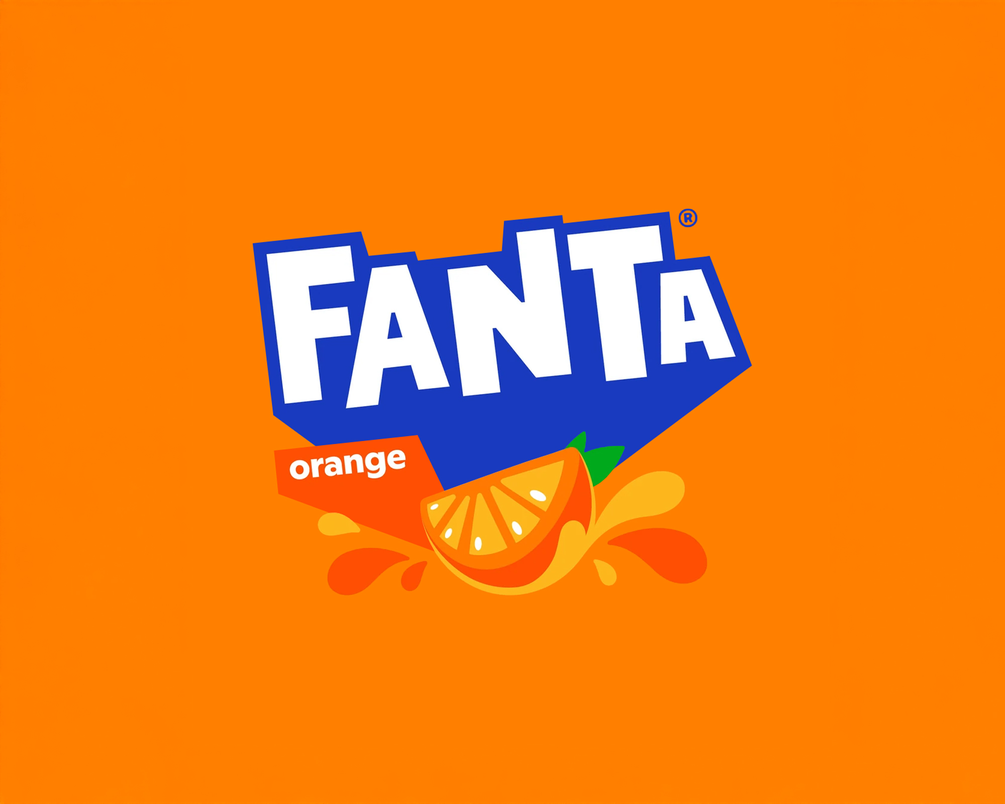
- Branding and identity: chosen by brands that want to appear energetic, friendly, and approachable (e.g. Fanta, Amazon, Nickelodeon).
- Events and promotions: it enhances visibility and communicates excitement.
- Youthful or creative projects: perfect for conveying a spirit of fun and originality.
Orange across industries
- Technology and entertainment: communicates empathy and energy (e.g. SoundCloud, Firefox).
- Food & beverage: suggests freshness and appetite—popular for juices, snacks, and summer products.
- Tourism and events: conveys adventure, fun, and experience.
- Education and training: stimulates the mind and supports creativity and engagement.
Risks of using orange
While orange is friendly and dynamic, it should be used in moderation. Too much can appear overwhelming or childish. For balance, it pairs well with neutral tones or darker accents (like navy blue, anthracite, or earthy browns) to maintain harmony and readability.
Conclusion
Orange is the color of positive energy, dialogue, and action. When used thoughtfully in design, it conveys enthusiasm, sparks creativity, and draws attention with a warm and confident tone. It’s the ideal color to capture the bright, engaging side of summer—and of your visual projects.
Next month, we’ll explore another color—perhaps one more introspective. Curious to find out which? Stay tuned!

